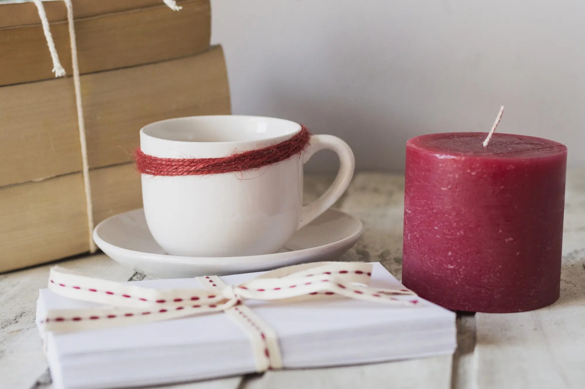
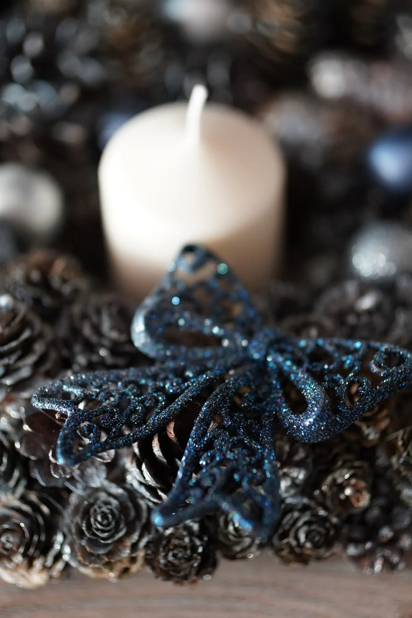
Use warmth to radiate conviviality, spice, and enveloping comfort, leaning into ambered corals, terracotta peaches, and burnished reds that suggest gatherings, laughter, and cozy tables. Cool palettes—sea-glass teals, misted blues, and eucalyptus greens—clear mental fog and promise restorative quiet. In blended collections, consider bridging zones with transitional hues like mauve, slate, or smoky olive that temper extremes. Let fragrance alignment guide the dial: cinnamons ignite warmth, eucalyptus breathes coolness, while vanillas can warm or cool depending on undertone and vessel reflectivity.

Neutrals are not passive; they are conductors that pace visual rhythm. Cream with a buttery undertone softens gourmand notes, greige stabilizes herbal blends, and charcoal grounds coastal palettes without stealing light. Be attentive to value differences between wax, label, and vessel so contrast feels intentional rather than accidental. Texture matters too: a bone-matte jar paired with parchment labeling signals artisanal restraint, while a satin stone finish with crisp white wax whispers spa-like clarity. Neutrals hold space for scent complexity and underscore your brand’s quiet confidence.

High saturation shouts delight, festival energy, and photogenic impact, useful for limited editions or celebratory gifting. Desaturating tones introduces tenderness and longevity, reassuring shoppers they will enjoy pieces year-round. Try micro-variations: blush versus dusty rose, moss versus sage, ink versus midnight. Each shift nudges memory and mood differently. When photographing, track how saturation renders on screens, because boosted filters can misrepresent nuance. Invite testers to journal perceptions at first sight, then after burning, noting whether color intensity complemented or overshadowed the evolving fragrance trail.

Warm bulbs flatter caramels and creams but can muddy delicate greens. Cooler daylight reveals dust, fingerprints, and slight undertone shifts. Create a simple rig with dimmable lamps, a North-facing window, and blackout curtains to standardize comparisons. Photograph each setup with color checkers and note emotional readouts—calm, cozy, crisp—from multiple viewers. Remember that evening rituals often happen under 2700K lamps; ensure your soothing palettes still soothe after sunset, when screens glow and eyes tire. Share your findings publicly to build credibility and invite collaborative refinement from engaged customers.
Two materials can match in one light yet diverge in another. Paraffin, soy, and coconut blends accept pigments differently; micas sparkle in daylight but can gray in shadow. Clear coats on ceramic alter perceived depth; matte sealers lower saturation yet elevate tactility. Keep a swatch library labeled with batch numbers, cure times, and lighting notes. When a beloved shade shifts unexpectedly after curing, adjust formula or vessel rather than forcing a mismatched story. Transparency in product notes about natural variance nurtures trust and turns minor quirks into artisanal charm.
Send small testers with feedback cards and a simple prompt: write three emotions before lighting, midway through burn, and post-extinguish. Ask for room type, wall color, bulb temperature, and time of day. Patterns will emerge—how taupe jars calm beige bedrooms, or how cobalt pops on oak shelving. Translate insights into micro-collections tailored to morning desks, evening baths, or intimate dinners. Publicly thank contributors, fold names into story cards, and invite them back for next rounds. Co-creation deepens loyalty and refines your palette more than solitary studio hunches.
Names steer perception before sight. Instead of generic labels, try evocative phrasing—Harbor Mist, Orchard Butter, Page-Turner Night—tying color, scent, and setting. Avoid cultural borrowing without care. Test names aloud; cadence matters. On packaging, include a single guiding sentence that sets intention without dictating experience. Encourage buyers to journal their own associations and share them back. Over time, a lexicon emerges where words and hues harmonize, letting loyal customers navigate effortlessly toward the feeling they crave on rainy Mondays, first-day jitters, or quiet anniversaries.
From tissue tint to ribbon weight, staging primes emotion. A soft dove wrap around a sage jar lowers shoulders before the lid lifts. Embossed seals invite a pause; vellum notes transmit light like candle glow. Keep sustainability top-of-mind with recycled stocks and soy inks while maintaining tactile delight. Film short, honest unboxings under window light so viewers trust what they see. Invite customers to choose between two wrap colors at checkout, turning fulfillment into co-creation. That small agency reinforces connection and makes gifting feel considered and personal.
Sustain momentum by gathering responses across channels—comments, polls, pop-up swatch walls, and in-home trials. Publish recap posts that explain what changed and why, crediting contributors. Offer early-access drops to participants, rewarding curiosity with belonging. Track which colors earn refills, not just likes, and celebrate quiet winners that anchor routines. Create seasonal open calls for palette ideas tied to moods rather than occasions, then prototype a few and report results. This transparent, cyclical practice turns your studio into a living laboratory where color, story, and care continually mature.
All Rights Reserved.