
Start Your Emotion‑Focused Candle Journey Today
Foundations That Shape Feeling
Scent Architecture That Guides The Heart
Building Accords For Calm, Joy, And Focus
Essential Oils And Fragrance Oils: Honest Trade‑Offs
Scent Throw Testing And Reflective Notebooks
Color, Vessels, And Quiet Design Signals
Color Selection As An Emotional Overture
Use dye sparingly for clarity or embrace marbled swirls for tactile depth. Cool palettes may cool the pulse; earth tones can anchor scattered afternoons. Test transparency against flame for halo effects and consider how color interacts with fragrance expectations. Consistency across jars reinforces trust, while seasonal accents add playful novelty. Let every hue whisper intention without shouting or crowding quiet feelings.
Vessels: Glass, Tin, Or Ceramic, And Their Behaviors
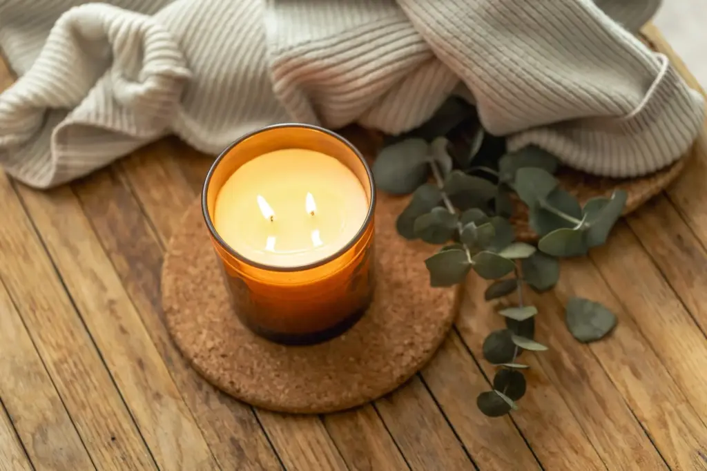
Clear glass showcases flame choreography but demands tidy pours and careful wick centering. Tins cool faster and travel well, ideal for thoughtful gifting. Ceramics retain heat and feel artisanal, yet require precise testing. Always ensure heat resistance, avoid tapering that traps melt pools, and leave headspace. The container becomes architecture, shaping safety, burn profile, and how comfort visually resides.
From Melt To Memory: Method Matters
Temperature Control And The Pouring Window
Curing Patience And The First‑Burn Lesson
Troubleshooting As A Story Of Progress
Curating A Cohesive First Collection
Launch With Care, Learn With Community
Gentle Pilot Releases And Feedback Loops
Photographing Mood Honestly
Join Us, Subscribe, And Share Your Moments
All Rights Reserved.