
Stirring Emotion with Color: Candles that Speak Before the Flame

Step into an expressive practice where wax, pigment, light, and vessel design collaborate to guide feelings and memories. We explore color psychology for candle makers, designing mood-evoking palettes and vessels that harmonize with scent, ritual, and brand identity. Learn how hue, value, and saturation whisper distinct stories, how finishes shape glow, and how cultural meanings matter. Experiment with thoughtful combinations, share your tests with our community, and subscribe to continue growing your sensory craft with supportive, actionable inspiration.

Decoding Hue, Value, and Saturation

Before pouring a single ounce of wax, understand how hue, value, and saturation quietly choreograph emotional responses. Warm hues often spark energy or intimacy, cooler palettes can soothe and clarify, and muted tones introduce subtlety. Adjusting lightness shifts perceived airiness, while saturation controls intensity. When you combine these levers with fragrance and vessel finish, you craft a multidimensional message that greets the eye, anticipates the nose, and primes the heart, inviting a deliberate, repeatable sensory experience your customers will recognize and trust.

Warm vs. Cool: Temperature that Tells a Story

Use warmth to radiate conviviality, spice, and enveloping comfort, leaning into ambered corals, terracotta peaches, and burnished reds that suggest gatherings, laughter, and cozy tables. Cool palettes—sea-glass teals, misted blues, and eucalyptus greens—clear mental fog and promise restorative quiet. In blended collections, consider bridging zones with transitional hues like mauve, slate, or smoky olive that temper extremes. Let fragrance alignment guide the dial: cinnamons ignite warmth, eucalyptus breathes coolness, while vanillas can warm or cool depending on undertone and vessel reflectivity.

Neutrals with Intention: Beyond Background

Neutrals are not passive; they are conductors that pace visual rhythm. Cream with a buttery undertone softens gourmand notes, greige stabilizes herbal blends, and charcoal grounds coastal palettes without stealing light. Be attentive to value differences between wax, label, and vessel so contrast feels intentional rather than accidental. Texture matters too: a bone-matte jar paired with parchment labeling signals artisanal restraint, while a satin stone finish with crisp white wax whispers spa-like clarity. Neutrals hold space for scent complexity and underscore your brand’s quiet confidence.

Saturation and Softness: Dialing Emotional Volume

High saturation shouts delight, festival energy, and photogenic impact, useful for limited editions or celebratory gifting. Desaturating tones introduces tenderness and longevity, reassuring shoppers they will enjoy pieces year-round. Try micro-variations: blush versus dusty rose, moss versus sage, ink versus midnight. Each shift nudges memory and mood differently. When photographing, track how saturation renders on screens, because boosted filters can misrepresent nuance. Invite testers to journal perceptions at first sight, then after burning, noting whether color intensity complemented or overshadowed the evolving fragrance trail.

Designing Palettes that Match Scent Journeys

Color can foreshadow notes within the fragrance pyramid, creating satisfying crossmodal correspondences that help buyers choose confidently. Map top notes to brighter values, heart notes to balanced midtones, and base notes to deeper, anchoring hues. Keep chroma aligned with intensity: zingy citrus loves luminous clarity, while resinous woods prefer rooted depth. Let transitional gradients on labels or vessels hint at evolution through the burn. Most importantly, test for congruence; misaligned color-scent pairings can cause cognitive dissonance that undermines perceived quality and repeat purchases.

Vessel Aesthetics: Shape, Finish, and Light Behavior

Matte Serenity vs. Gloss Drama

Matte surfaces swallow highlights, producing velvety color that reads grounded and sophisticated, ideal for mindfulness blends or minimalist interiors. Gloss reflects, heightening contrast and spectacle, perfect for celebratory releases and bold florals. Fingerprints and dust read differently on each, shaping upkeep impressions. Evaluate label adhesives accordingly; matte likes textured stocks, gloss pairs with smooth, coated papers. Photograph both under identical light to confirm narrative fit, then poll customers about which finish supports their rituals—quiet journaling, social hosting, or self-gifting—so your assortment respects real lives, not just studio ideals.

Transparent Tints and the Dance of Flame

Tinted glass turns the flame into a color instrument, shifting ambiance as wax recedes. Soft smoke, tea, or mineral tints offer complexity without heavy saturation, while jewel tones intensify sparkle. Watch for color cast on walls; rosy glass warms, aqua cools. Pair wick type and diameter to ensure even illumination, preventing tunnel shadows that distort hue perception. Invite testers to photograph the candle at different burn stages, noting how tint interacts with melt pool and soot lines, then refine thickness and transparency for a consistently flattering, mood-forward glow.

Shape Psychology: Curves, Cylinders, and Hand Feel

Round forms suggest safety and embrace, echoing bedtime or bath rituals. Tall cylinders feel elegant, guiding the eye upward for dining tables and mantels. Low, wide bowls encourage communal burning, ideal for gatherings where flicker becomes centerpiece conversation. Consider the thumb’s landing spot, rim thickness, and base weight; tactility reinforces perceived quality. Shape also frames color proportion—slender walls make hues lighter, thick walls deepen. Prototype with clay blanks and water instead of wax to preview balance, then survey customers holding cold vessels to capture subconscious preferences before production.

Cultural and Contextual Color Meanings

Colors carry layered histories that shift by region, occasion, and subculture. Red may celebrate prosperity in one context, romance in another, and urgency on signage. White can bless, mourn, or sterilize depending on tradition. Research your audience’s references, holidays, and interiors before locking palettes. Consider accessibility and inclusion, avoiding coded combinations that alienate. If selling globally, adapt labels and photography so intent remains clear. Let curiosity lead, asking customers to share associations, then weave respectful insights into product names, storytelling cards, and seasonal edits that feel genuinely thoughtful.
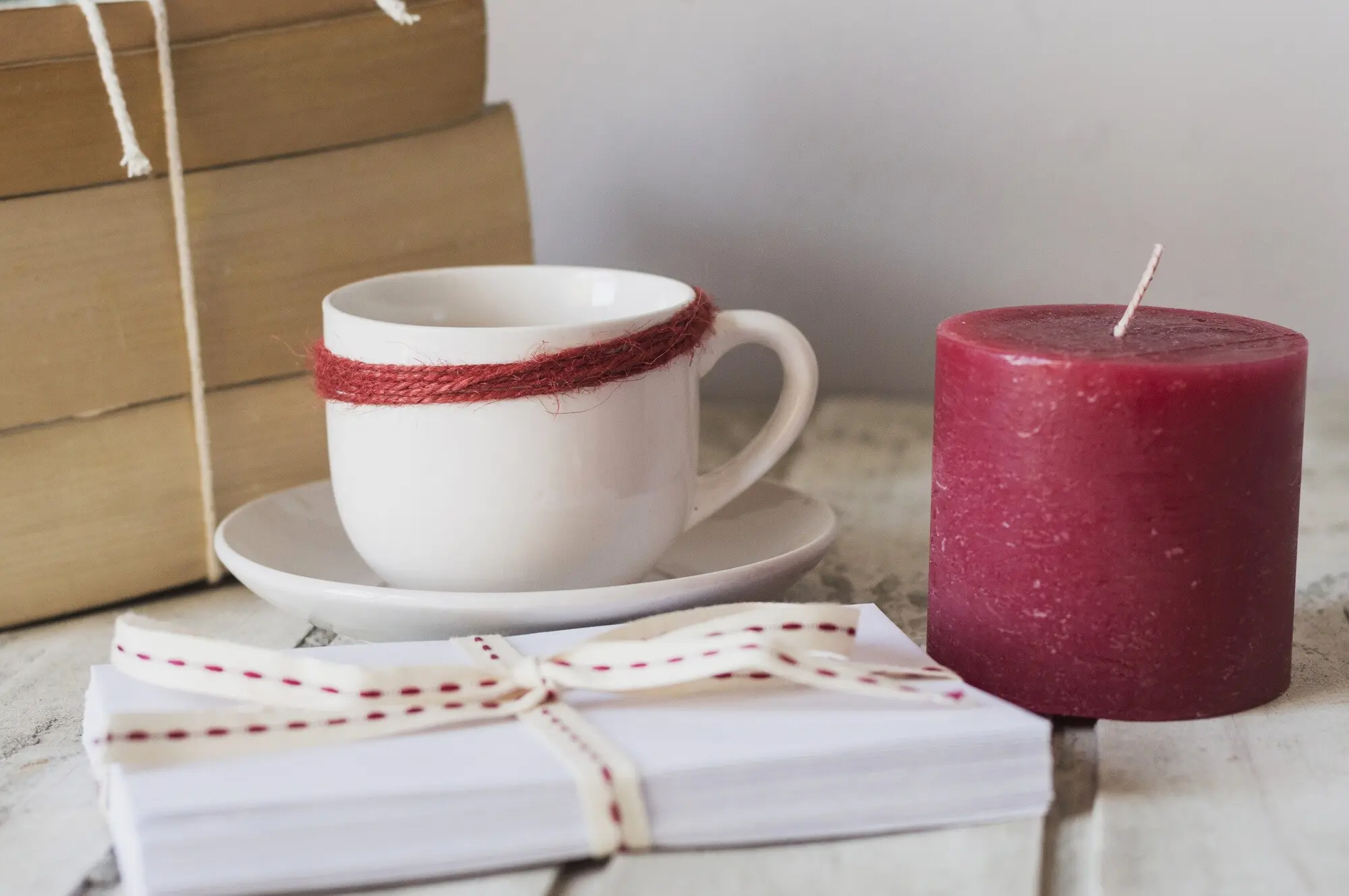
Deploy red with precision, pairing undertone to message. Blue-reds skew elegant and romantic, while orange-reds feel festive and lively. In some markets, saturated crimson signals celebration and abundance; elsewhere it can read as stop or sale. Temper intensity with textured papers, or echo spice notes—cinnamon, clove—to anchor meaning. Test copy carefully; one word can swing from passion to aggression. When in doubt, introduce red as an accent on lids, ribbons, or wax seals, letting fragrance and vessel balance the color’s persuasive, sometimes polarizing, psychological volume.
White is rarely neutral; cool whites can feel gallery-clean, warm ivories feel candlelit and nostalgic. In wedding gifting, soft ivory soothes; in wellness, crisp white suggests clarity and order. Beware harsh LED photographing that turns whites sterile. Layer subtleties—linen-textured labels, blind emboss, or pearlescent foils—to keep minimal palettes luxurious. If your wax is naturally off-white, embrace it; honesty reads premium. Encourage customers to notice how white spaces around color breathe, allowing scent notes to shine while the vessel acts like a quiet frame rather than a loud proclamation.
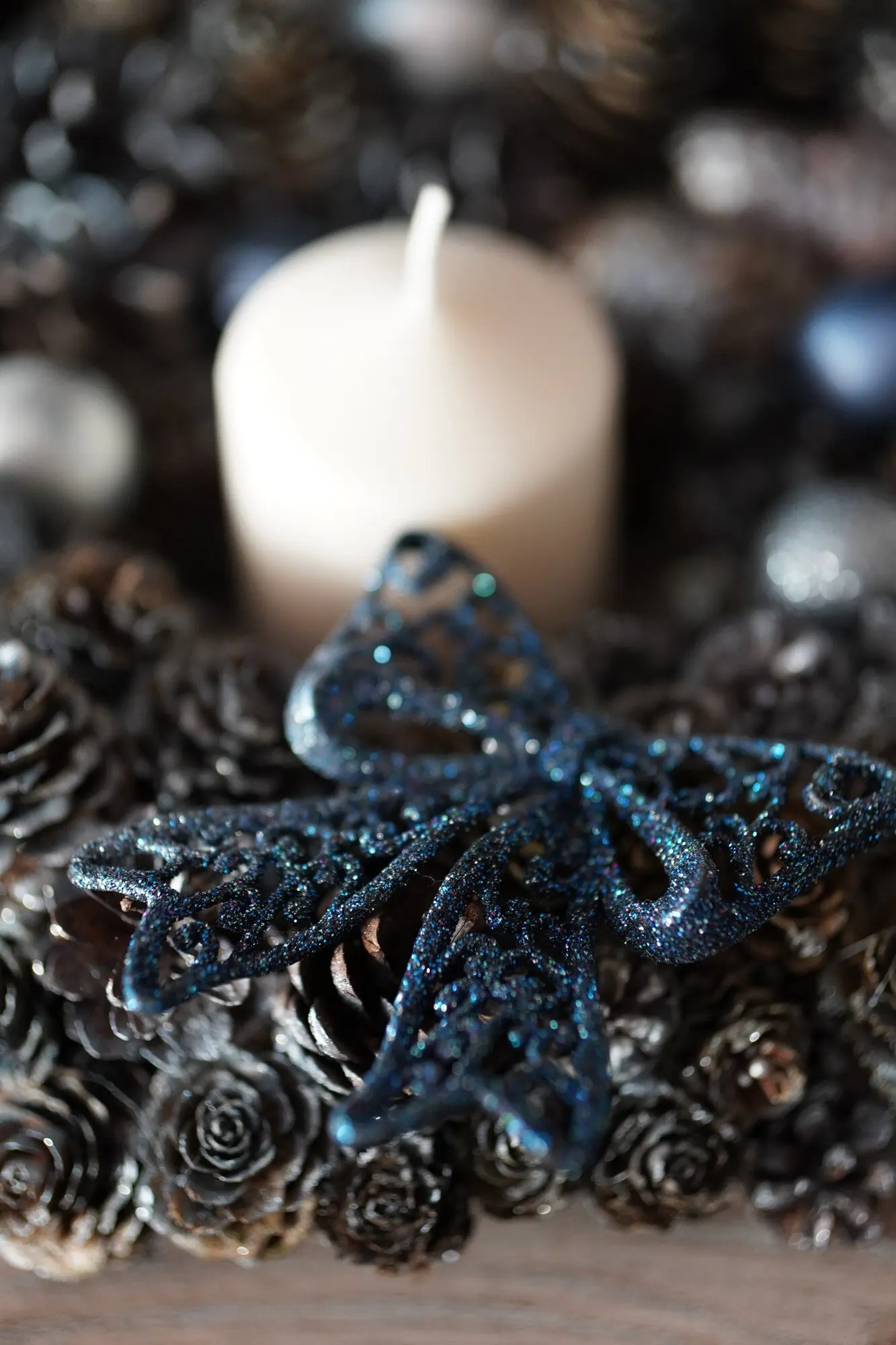
Seasonal palettes guide anticipation. Winter leans into inky blues, pewter grays, and soft snow tones that echo stillness and reflection. Spring brightens with tender greens and petal blushes. Summer invites coral, seafoam, and sand for airy gatherings. Autumn deepens into ochre, russet, and plum, promising hearth and spice. Resist clichés by adding unexpected bridges—storm lavender in winter, mineral teal in autumn. Rotate accents while preserving core brand anchors, helping returning customers recognize your hand across seasons and feel guided rather than whiplashed by trend-chasing shifts.

Brand Identity and Shelf Impact

A coherent color system makes recognition effortless across jars, boxes, refills, and digital assets. Choose primaries that state your spirit, supportive neutrals for flexibility, and accents for launches. Plan contrast for legibility in dim boutiques and warm homes. Prototype shelf sets at eye level, photographing from five feet to mimic browsing distance. Ensure color reproduction is consistent between suppliers and batches. Where possible, align palette with scent architecture, so even a stacked shipper tells a silent story that invites hands to reach, sniff, and start a meaningful ritual.

Testing, Lighting, and Real-World Perception

Color shifts under varied bulbs, walls, and weather. What looks balanced in the studio may skew green beneath office LEDs or golden beside pine furniture. Build a test kit spanning 2700K to 5000K bulbs, daylight windows, and candlelit rooms. Compare dyes, micas, and coatings for metamerism. Invite beta customers to place samples in kitchens, bedrooms, and bathrooms, journaling feelings before lighting, midway through burn, and at extinguish. Turn observations into iterative tweaks, protecting your promise that every jar supports the desired mood wherever it finally lives.

Light Temperature Trials: 2700K to Noon Sun

Warm bulbs flatter caramels and creams but can muddy delicate greens. Cooler daylight reveals dust, fingerprints, and slight undertone shifts. Create a simple rig with dimmable lamps, a North-facing window, and blackout curtains to standardize comparisons. Photograph each setup with color checkers and note emotional readouts—calm, cozy, crisp—from multiple viewers. Remember that evening rituals often happen under 2700K lamps; ensure your soothing palettes still soothe after sunset, when screens glow and eyes tire. Share your findings publicly to build credibility and invite collaborative refinement from engaged customers.

Material Metamerism: Dyes, Micas, and Coatings

Two materials can match in one light yet diverge in another. Paraffin, soy, and coconut blends accept pigments differently; micas sparkle in daylight but can gray in shadow. Clear coats on ceramic alter perceived depth; matte sealers lower saturation yet elevate tactility. Keep a swatch library labeled with batch numbers, cure times, and lighting notes. When a beloved shade shifts unexpectedly after curing, adjust formula or vessel rather than forcing a mismatched story. Transparency in product notes about natural variance nurtures trust and turns minor quirks into artisanal charm.

Home Trials: Real Rooms, Real People, Real Feelings

Send small testers with feedback cards and a simple prompt: write three emotions before lighting, midway through burn, and post-extinguish. Ask for room type, wall color, bulb temperature, and time of day. Patterns will emerge—how taupe jars calm beige bedrooms, or how cobalt pops on oak shelving. Translate insights into micro-collections tailored to morning desks, evening baths, or intimate dinners. Publicly thank contributors, fold names into story cards, and invite them back for next rounds. Co-creation deepens loyalty and refines your palette more than solitary studio hunches.

Storytelling, Ritual, and Customer Connection

Color becomes unforgettable when entangled with narrative and touch. Names, unboxing, and burn rituals anchor memory so shades feel like companions rather than decorations. Design cards that coach small ceremonies—striking the match, breathing deeply, noticing the hue against surrounding textures. Pair playlists or poetic lines to extend atmosphere. Invite comments, scent-color memories, and shelf photos, turning your brand into a vibrant circle. Encourage newsletter signups for early swatches and behind-the-scenes palettes, building anticipation that makes each release an intimate, shared moment rather than a transaction.

Naming with Nuance: Words that Color the Mind

Names steer perception before sight. Instead of generic labels, try evocative phrasing—Harbor Mist, Orchard Butter, Page-Turner Night—tying color, scent, and setting. Avoid cultural borrowing without care. Test names aloud; cadence matters. On packaging, include a single guiding sentence that sets intention without dictating experience. Encourage buyers to journal their own associations and share them back. Over time, a lexicon emerges where words and hues harmonize, letting loyal customers navigate effortlessly toward the feeling they crave on rainy Mondays, first-day jitters, or quiet anniversaries.

Unboxing Theatre: Layers, Textures, First Impressions

From tissue tint to ribbon weight, staging primes emotion. A soft dove wrap around a sage jar lowers shoulders before the lid lifts. Embossed seals invite a pause; vellum notes transmit light like candle glow. Keep sustainability top-of-mind with recycled stocks and soy inks while maintaining tactile delight. Film short, honest unboxings under window light so viewers trust what they see. Invite customers to choose between two wrap colors at checkout, turning fulfillment into co-creation. That small agency reinforces connection and makes gifting feel considered and personal.

Community Feedback Loops and Iteration

Sustain momentum by gathering responses across channels—comments, polls, pop-up swatch walls, and in-home trials. Publish recap posts that explain what changed and why, crediting contributors. Offer early-access drops to participants, rewarding curiosity with belonging. Track which colors earn refills, not just likes, and celebrate quiet winners that anchor routines. Create seasonal open calls for palette ideas tied to moods rather than occasions, then prototype a few and report results. This transparent, cyclical practice turns your studio into a living laboratory where color, story, and care continually mature.

Moripexivarozentosentosira
Privacy Overview

This website uses cookies so that we can provide you with the best user experience possible. Cookie information is stored in your browser and performs functions such as recognising you when you return to our website and helping our team to understand which sections of the website you find most interesting and useful.